Summary:
In the realm of financial technology, the brand is not just a logo; it's a promise. As a product designer at Kora, I had the incredible opportunity to play a pivotal role in shaping and evolving the Kora brand. Our mission was clear: to empower our users to thrive financially, grow their wealth, and protect their assets.
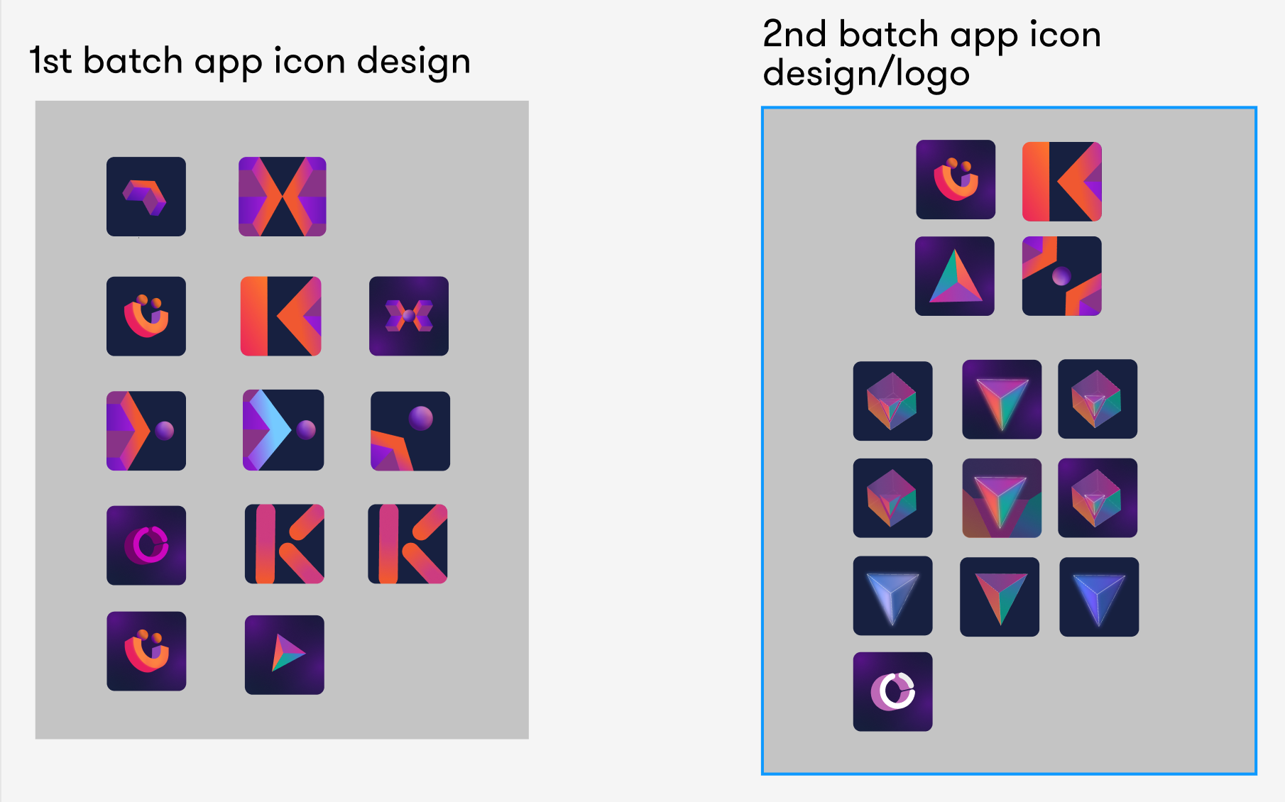
This branding journey was about more than just aesthetics; it was about embodying these core principles and values. Notably, the company had a strong desire for the design to incorporate the letter "K," symbolizing a connection between the brand and its users.
Brand Pillars: Thrive, Grow, Protect:
Thrive: The essence of financial wellness. We aimed to create a brand identity that conveys vitality, growth, and abundance, all while subtly integrating the "K" to resonate with our brand name.
Grow: The heart of financial prosperity. The brand needed to communicate a sense of continuous improvement, upward momentum, and the potential for endless expansion, with the "K" seamlessly woven into the design.
Protect: The foundation of financial security. We strived to build a brand that exudes trust, safety, and reliability, with the letter "K" forming an integral part of the visual identity.
Initlal Sketches and Mind Map
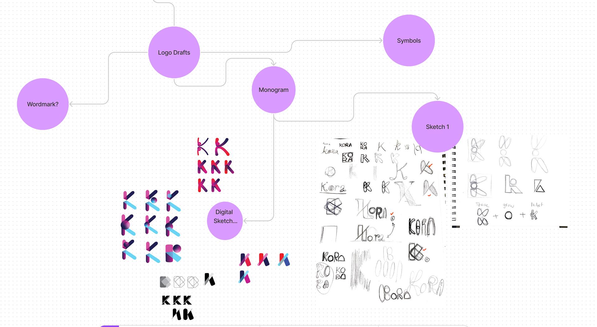
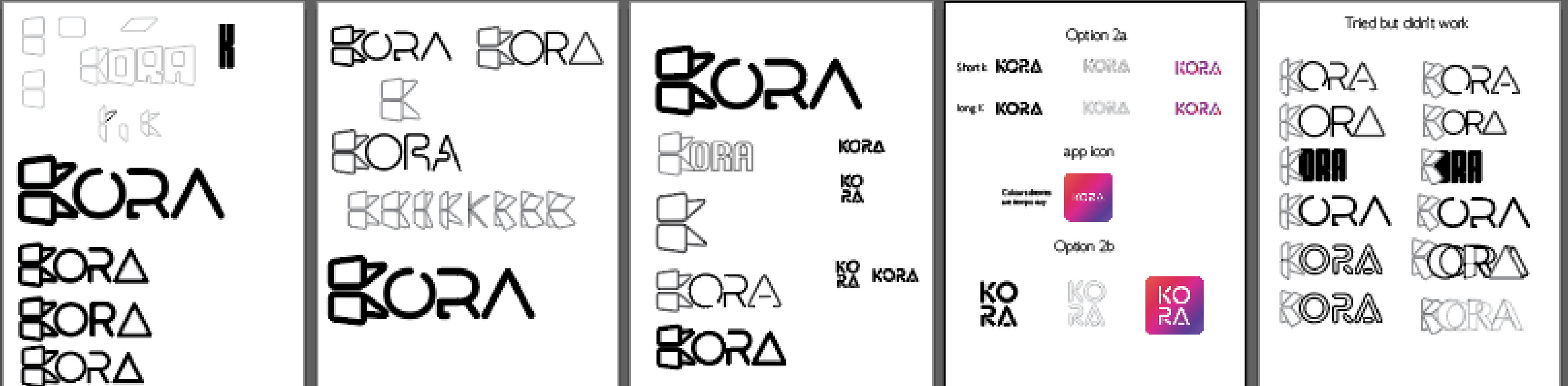
Concrete Contenders

User-Driven Testing and Stakeholder Decision:
Our design journey at Kora was a collaborative process, driven by a commitment to delivering a brand that resonates with users and aligns with our core values. To ensure that our final branding design was more than just aesthetically pleasing, we engaged in comprehensive user testing.
Through surveys and user feedback, we tested a range of design options, each thoughtfully crafted to capture the essence of financial thriving, growth, and protection, while incorporating the symbolic "K" element. The insights gathered from these surveys were invaluable in shaping our brand identity.

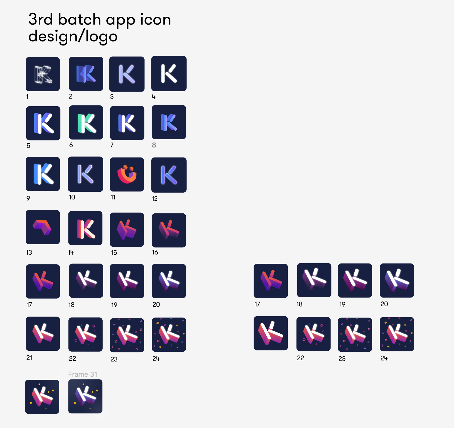
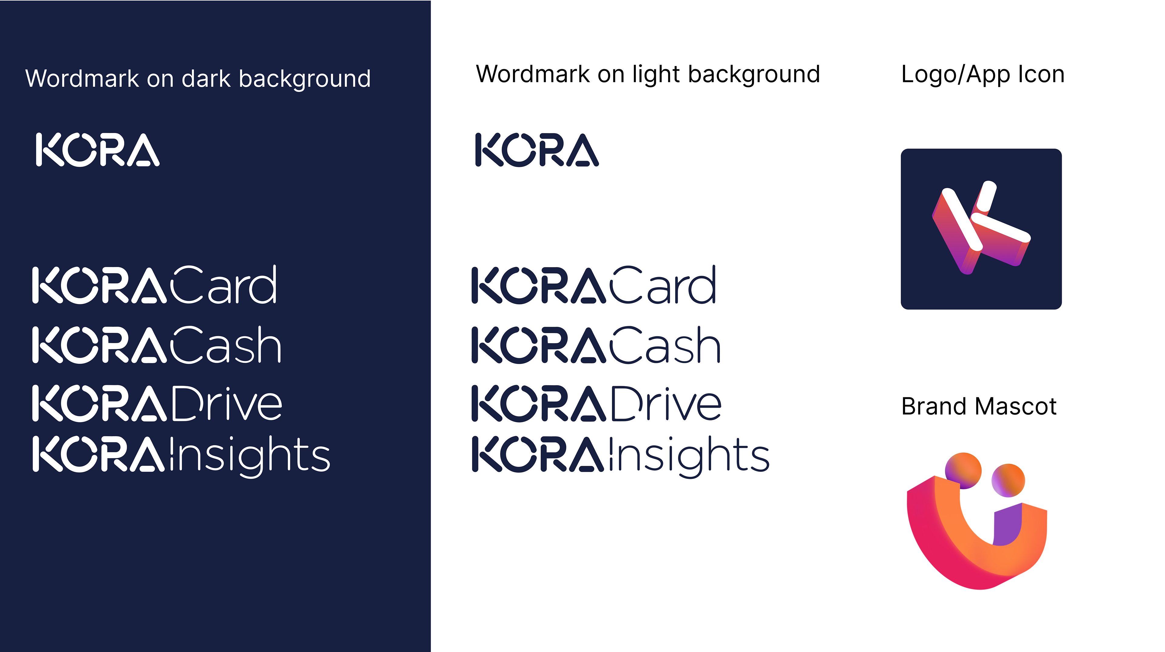
In the end, the decision on the final design was entrusted to our key stakeholders, including the Head of Marketing and our CEO. After careful consideration of user feedback, market analysis, and alignment with our brand's mission, the choice was made to go with a design featuring a raised "K" combined with a wordmark. This design perfectly encapsulated our commitment to empowering our users to thrive, grow, and protect their financial well-being.